Reports and Analytics
The Report generating module in 3PM allows users to generate standard reports and visualize them. Reports can be generated using the Pivot Table which generates tabular reports, and the Data Visualizer which generates reports in form of charts eg. bar graphs and line graphs. A user can access either the Data Visualizer or the Pivot Table from the Apps Menu as shown below.
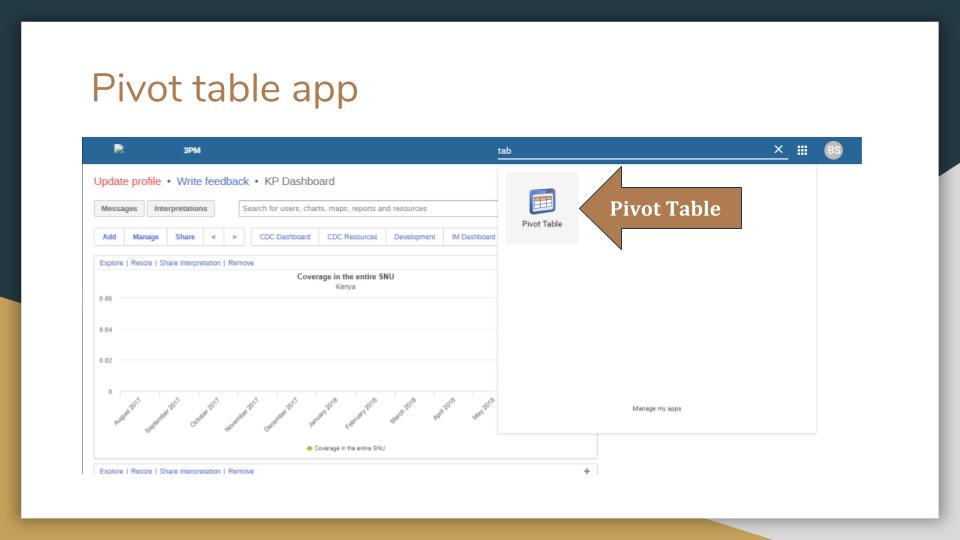
Figure 1: Select Pivot Table
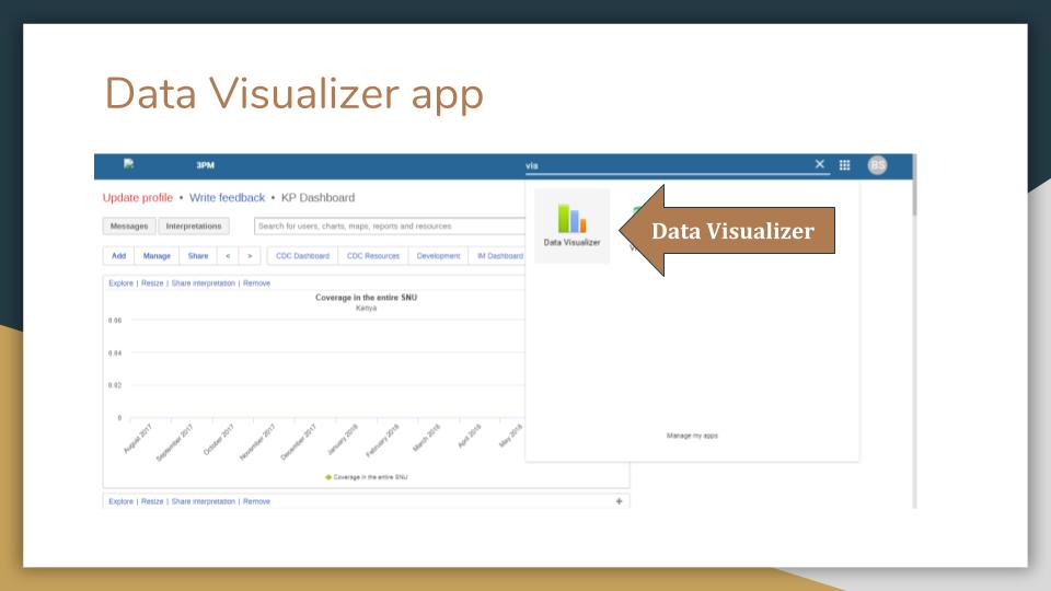
Figure 2: Select Data Visualizer
This will navigate the user to Pivot Table and Data Visualizer respectively, from where they can generate a report following the pictorial procedure shown below.
Report Generation
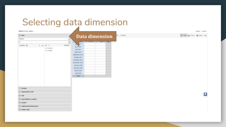
Figure 3: Select Data Dimension
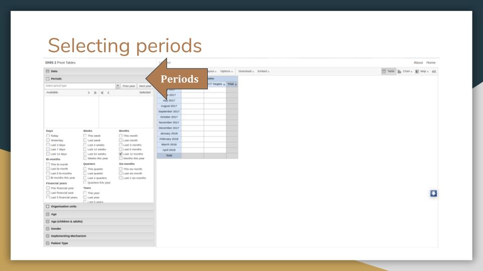
Figure : Select Period
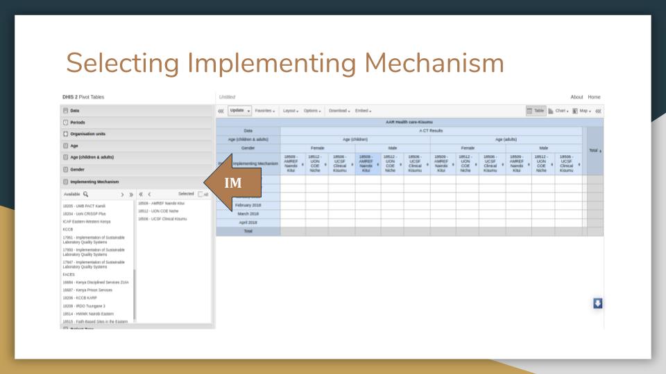
Figure : Select Implementing Mechanism
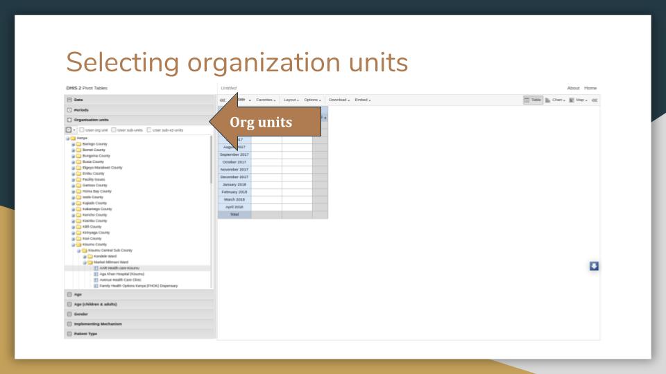
Figure : Select Organisation Unit
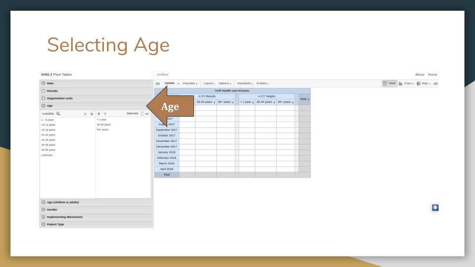
Figure : Select Age Brackets
Whenever you modify the dimensions, you are required to click Update button to have the changes reflected.
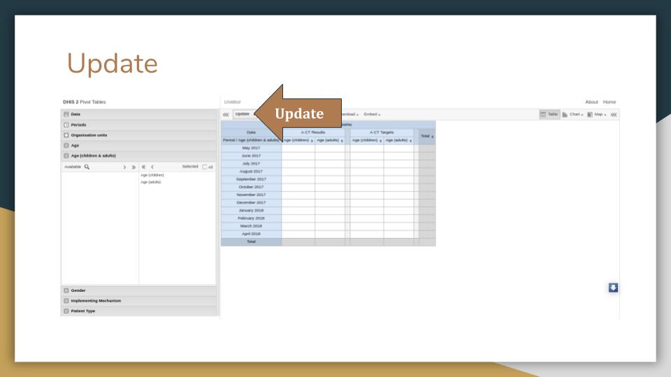
Figure : Click Update
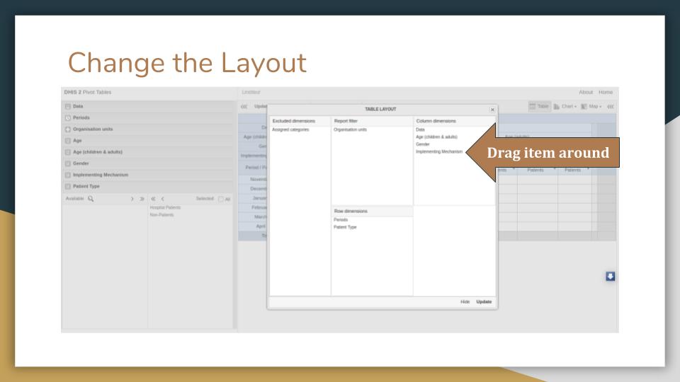
Figure : Change Layout
You can create a new pivot table, open an existing one, rename or delete an opened one on the Favorites menu.
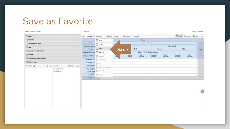
Figure : Save as Favorite
Dashboards
Once you are done generating a pivot table, you can navigate to the dashboard where you can add the saved favorite as a dashboard item.
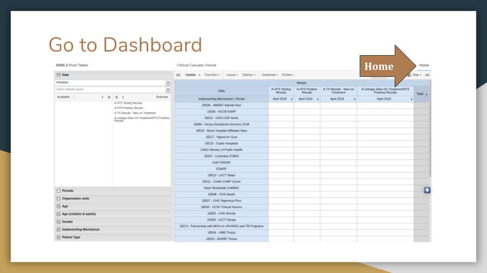
Figure : Go to Dashboard
You can only modify dashboard items for the dashboard you own or have edit rights. Therefore, to create a dashboard, follow the directions in the image below.
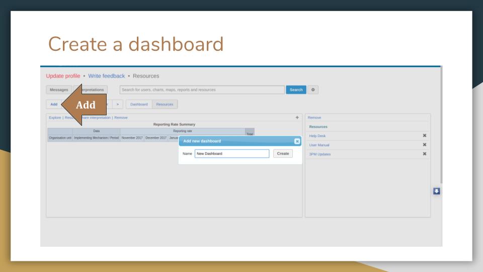
Figure : Create a Dashboard
Once you create a dashboard, you can then add items such as favorites, users, resources, reports to the dashboard as shown below.
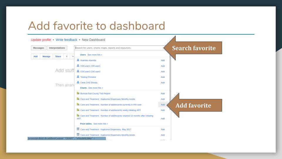
Figure : Add Favorite to Dashboard